Contributing to Meshery UI - Sistent
Prerequisite Reading
Contributing to Meshery UI - Sistent
Sistent is the design system used by Meshery UI. Sistent is an open source design system that offers building blocks to create consistent, accessible, and user-friendly interfaces. It’s aimed at developers who want to design applications aligned with the same brand and ensure a uniform user experience across different products.
Sistent leverages Material UI libraries and provides a custom theme on top of it for a consistent look and feel. It includes components, icons, and design tokens that developers can readily integrate into their applications. By using Sistent, developers can save time and effort while maintaining a high-quality user experience throughout Meshery.
Example
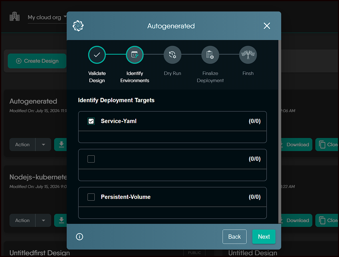
- This
Modalis a Sistent Standard Modal used in validation of design.
How to use Sistent in Meshery UI
Table of Contents
The Sistent design system includes a variety of base components such as Button, Textfield, Checkbox, and more, which can be found here
Additionally, it provides custom components like Modal, TransferList, and others, which are available here
Usage
- Import any base or custom component from
@sistent/sistent. Here’s how you can do it:
import {Button} from `@sistent/sistent`

function MyComponent() {
    return (
    <div>
      <Button
        variant="contained"
        onClick={onClick}
      >
      {/* Text to display */}
      </Button>
    </div>
  );
}

export default MyComponent;
How to use Tokens/Colors from Sistent theme
Let’s start with a few of the common terms that we will come across frequently, as understanding what they mean will inform us of applicable use cases and proper procedures that should not be overlooked.
Theme: A theme provides a cohesive and consistent look and feel for a product, achieved through harmonious color palettes, legible fonts, and layout patterns. Sistent specifies both light and dark themes.
Value: A value is a unique visual attribute assigned to a token via themes, such as hex codes or RGBA values, used to highlight specific colors. Avoid referencing exact values directly to ensure consistency; instead, use tokens to manage and implement reusable values.
Tokens: Tokens serve as a shared language between design and development, detailing how to build user interfaces. Tokens represent context (background, text, component), role (success, warning, brand, inverse), and modifiers (secondary, tertiary, hover) derived from the color palette.
Role: Roles specify the context for applying colors. Different roles can share the same value but will have different use cases due to the token structure. These values can vary depending on the current theme.
How to use these tokens/colors from Sistent theme
- Import the
useThemehook from@sistent/sistentto access the current theme. - Utilize the
useThemehook to access theme properties and apply them to your components, such as setting the background style of theButton.
import {Button, useTheme} from "@sistent/sistent";

function MyComponent() {
  const theme = useTheme();
  return (
    <div>
      <Button
        variant="contained"
        onClick={onClick}
        style={{
          background: theme.palette.background.default,
          text: theme.palette.text.secondary,
        }}
      >
        {/* Text to display */}
        Click Me
      </Button>
    </div>
  );
}

export default MyComponent;
The tokens and their roles are specific to their use. For example, use the background palette for background styles and the text palette for text styles.