Contributing to Meshery UI - Dashboard Widgets
Prerequisite Reading
Meshery’s dashboard is a composable and extensible interface made up of individual widgets. These widgets allow contributors to surface specific Meshery data or capabilities within a modular layout system.
This guide walks through the process of creating and integrating a custom widget into the Meshery dashboard. You’ll learn about layout configuration, design best practices, and how to register new widgets.
1. Widget Architecture
Widgets are React components located here:
/ui/components/DashboardComponent/widgets/
Each widget is rendered inside a card component (<PlainCard />, <DesignCard />, etc.), which is sourced from the Sistent design system.
Widgets can:
- Pull data from APIs (REST, GraphQL, RSS)
- Display static links or interactive components
- Include icons and thumbnails for user familiarity
2. Creating a New Widget
Create a new file inside widgets/, e.g.:
/ui/components/DashboardComponent/widgets/LatestBlogs.js
Use design system components from @sistent/sistent:
import { useTheme, PlainCard, BellIcon } from "@sistent/sistent";

const LatestBlogs = (props) => {
  const theme = useTheme();
  const { data: blogs } = useFetchBlogsQuery(); // fetch data from rtk query

  return (
    <PlainCard
      title="LATEST BLOGS"
      icon={<BellIcon {...props.iconsProps} />}
      resources={resources}
    />
  );
};

export default LatestBlogs;
Use useTheme() for consistent color tokens across themes.
3. Adding Thumbnails
Thumbnails are image previews of widgets. Place them here:
/ui/components/DashboardComponent/widgets/Thumbnails/
Recommended format: .png or .svg
Example:
import LatestBlogsThumbnail from "./Thumbnails/LatestBlogs.png";
To verify your thumbnail appears correctly, click on the “Edit” button on the Dashboard. A visual card with your thumbnail and widget title will be listed there, allowing users to add it to their layout.
4. Registering the Widget
Register your widget inside getWidgets.js:
export const getWidgets = () => ({
  LATEST_BLOGS: {
    title: "Latest Blogs",
    isEnabled: alwaysShown,
    component: <LatestBlogs />,
    defaultSizing: { w: 3, h: 2 },
    thumbnail: LatestBlogsThumbnail?.src,
  },
});
title: Display namecomponent: JSX elementisEnabled: Visibility flagdefaultSizing: Default dimensionsthumbnail: Path to preview image
5. Adding to Default Layout
To include your widget in the default dashboard layout:
/ui/components/DashboardComponent/defaultLayout.js
Layouts are defined per screen size breakpoint (e.g., sm, xs, xxs) to ensure responsiveness. Each layout item is an object with grid-based properties defined by the react-grid-layout library.
sm: tablets and desktops
xs: large phones
xxs: small phones
Example Layout Item:
{
  h: 2,                  // Height in grid units
  i: 'LATEST_BLOGS',     // Widget identifier (unique string)
  moved: false,          // Internal flag (do not change manually)
  static: false,         // If true, the widget cannot be dragged or resized
  w: 3,                  // Width in grid units
  x: 0,                  // Horizontal grid position (column index)
  y: 0,                  // Vertical grid position (row index)
}
Layout Field Descriptions:
- i: A unique string ID for the widget. This should match the widget’s
idused elsewhere in your code. - x: The column (starting from 0) where the widget should be placed.
- y: The row (starting from 0) where the widget should be placed. Widgets with the same
yvalue appear in the same row. - w: The widget’s width in terms of number of grid columns it should span.
- h: The widget’s height in terms of number of grid rows it should span.
- static: When
true, the widget is locked in place — it can’t be moved or resized. - moved: Used by the library to track user interactions. Leave as
false.
Here layout is based on a 12-column CSS grid. Each widget’s position is defined in terms of this virtual grid, which helps in building a responsive and flexible dashboard layout.
Define the widget’s position (x, y) and size (w, h) in each breakpoint for responsive behavior. The code for it can be found here.
Note: Layouts for Remote Providers are dynamically generated based on user configuration and stored remotely. Local providers use a predefined layout (LOCAL_PROVIDER_LAYOUT). Widgets must be added to both if you want consistent behavior across environments.
Meshery stores user layout preferences either in local storage or via the provider’s backend, depending on login state.
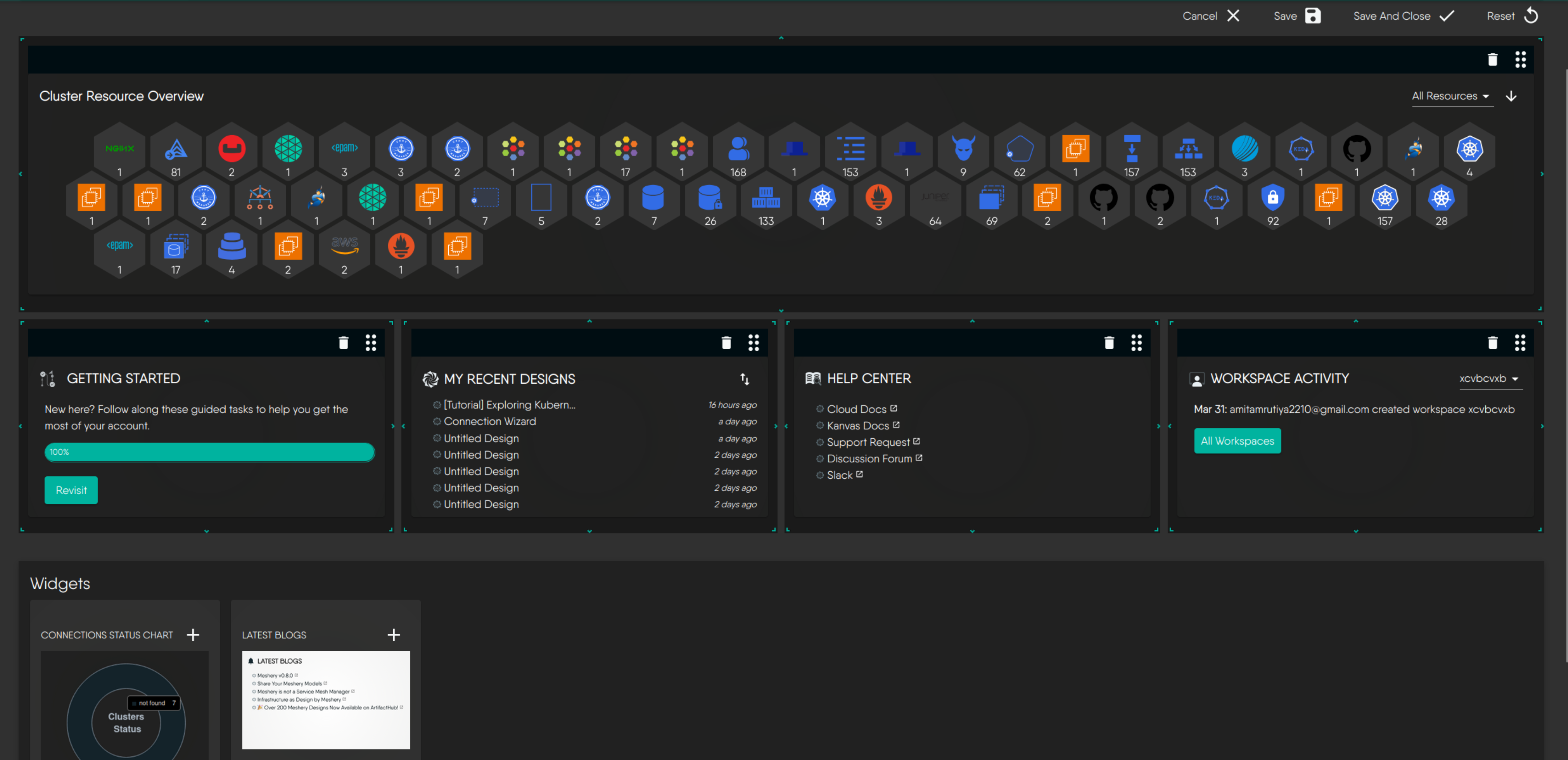
This is how your default widget would appear in the dashboard:
6. Best Practices
- Naming: Use uppercase keys (e.g.
MY_DESIGNS) for clarity - Icons: Use consistent design system icons (e.g.,
CatalogIcon,DesignIcon) - Themes: Use
useTheme()to access tokens - Responsiveness: Define layout for multiple viewports (
sm,xs,xxs) - Reusability: Break logic into reusable hooks when needed
- Thumbnails: Always include a visual thumbnail
- Permissions: If your widget accesses protected resources, ensure user has correct provider login state or roles.
7. Other Examples
| Widget | File | Data Source | UI Component |
|---|---|---|---|
| Latest Blogs | LatestBlogs.js | RSS Feed | PlainCard |
| Help Center | HelpCenterWidget.js | Static Links | PlainCard |
| My Designs | MyDesignsWidget.js | REST Api | DesignCard |
Note: MyDesignsWidget demonstrates integration with RTK Query hooks like useGetLoggedInUserQuery() and useGetUserDesignsQuery().
Have a look at existing Widgets here.
8. Publishing
Once your widget is working:
- Ensure it appears in the widget selector UI
- Validate layout and responsiveness
- Submit a PR with the new component, layout entry, and thumbnail. Here is a PR that adds Latest Blogs widget to Meshery Dashboard.
- Add your widget in the Meshery Extensions Catalog if appropriate